Some bluster about the National Gallery’s new Jan Vermeer exhibition got me thinking about how we like to consume art, and that eternally fraught question about how we quantify ‘value’ – so intangible, so subjective – in any cultural experience.
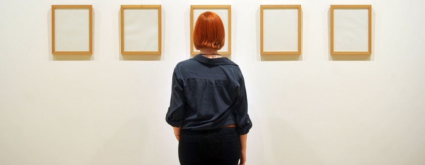
It’s been argued that the Vermeer show represents poor value for money because it features ‘only’ five of the Dutchman’s paintings, and we’re all used to consuming walls upon walls of paintings in one go, rather than a handful.
Albeit that there’s only 30-odd Vermeer paintings in existence; and that this particular collection also includes many fascinating works by the Old Master’s contemporaries; and that the National Gallery is otherwise a stupendous free resource, the point about the exhibit not meeting usual size expectations is a fair one.
In 2013, it does rankle that a pound buys you half the amount of stuff it did ten years ago; and that although it’s the same with stamps, pints, and rail fares, an art exhibition seems to cost double what it used to. But the objective truths about our bad economy shouldn’t be allowed to infiltrate our concept of value, which is a subjective, personal judgement as to whether something enriches you, benefits you, inspires you, and so on.
You might say those Vermeer paintings have to work harder to provide good value, since there’s only five of them. Or that the new LS Lowry exhibition at Tate Britain has a job to justify its £16.50 entry. Value often comes down to this old quantity/quality argument. But in the case of art, I’d suggest that less really is more.
Normally, less is less. Yes, value can be found in the smallest thing, but I’m wary of what this licenses people to do. Pay £6 for a tiny shard of brownie in an artisan cafe in Hackney, and you’ll feel it should have been bigger. It would be better without the laconic streaks of raspberry gloop across the plate, but more importantly, by being bigger. Super-sized. ‘Americanised’, perhaps.
But this logic won’t hold true with museums, I discovered when doing some Stateside voyaging recently. Like everything in the country, the galleries come in big, rich portions. You pay a lot, but you get the chance to gorge yourself on a lot too; so it’s a bit like going for a meal over there, without any of the sorry business of tipping.
Haring from city to city like some culture-crazed Jules Verne protagonist, I attempted to consume every last artefact and painting in every room of every wonderful gallery along the east coast, and from this fanaticism all I got was a constant sensation of being exceedingly full up, and skeletal issues associated with mooching around lots of rooms for lots of time (I’m 22).
It was the Met, in New York, that did me in; its room attendants directing me around not with obvious waypoints like they do in London galleries, but by geographical co-ordinates, the angle of the sun, and by the number of miles (miles) I needed to walk.
Great choice, but great value too? It depends on whether you’re susceptible to being overwhelmed, which I was.
They’re invariably bad value if you try to do them in one go. And that’s why people rarely ‘get’ anything out of foreign museums. You see them drifting, abstractedly, pausing to scrutinise a random name plate, which, instantly forgotten, is blurrily photographed (as per the continental fashion) for some album which will never happen, before the item itself is spared a cursory glance and also instantly forgotten.
It’s better to be practical: to beeline for a select few treasures, whose memories you can take home. That’s why I’m a fan of the Vermeer exhibit. Betsy Weiseman’s team has given us a digestible little set, which better lends itself to concentration and enjoyment.
They took a similar tack a couple of years ago with the Da Vinci exhibition, whose queues of punters spoke volumes about people enjoying intense, focused cultural experience above mindless drifting through labyrinths of stuff.
It’s worth moderating your consumption of art – for the same reason that you wouldn’t, in sound mind, listen to 300 songs in one sitting, or attend a hot dog-eating contest. Trust me, I witnessed one while I was in the US: it’s what all the fans were doing to take their minds off the game of baseball they were at.
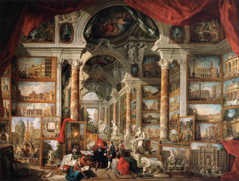
Historically, picture-crammed walls in salons – as immortalised by some charming Panini pictures – were the way to go. Then people realised that good works, and indeed the people looking at them, need space to breathe. And every year, it vexes me when the Royal Academy’s Summer Exhibition employs the cram-‘em-in tactic as a kitsch throwback, and arguably devalues each work.
 Giovannia Paolo Panini, ‘Gallery of Views of Ancient Rome’ (1758); typifying the archaic ‘cram-’em-in’ tactic still beloved by the Royal Academy
Weiseman is just asking us to look at art in a modern, engaged way. In so doing, she’s also reminded us that the best thing about any museum is its accessibility to home – and that special relationship you build, where you can pop in casually to take in a few little gems.


